
I feel weirdly possessive of this old frog
I feel weirdly possessive of this old frog
Inspiration #1

I often get asked about my influences and inspirations, and I find it a tricky one to answer. When you’ve been staring out of windows and scribbling away for as long as I have, there’s a lot of accumulated inspiration that probably filters through, even though it’s rarely a conscious process.
When I finished my debut book Hiding Heidi, I noticed that the three front postcards leaning against my monitor pretty much summed up my general approach to image making…

1- Frog by Matsumoto Hoji - 1814 (please note!!)
This postcard has been pride of place in my studio for years. I love the bold simplicity of the print, the limited palette, and the imperfect texture. This beloved frog represents a bold ‘less is more’ approach and relates to my rubber stamp printed work and areas of textured colour. This also links in with my love of blocky vintage lithographs, printed ephemera and 1920s to 1940s Russian illustration.
I actually feel weirdly possessive of this old frog, as if he’s mine and only mine, but I know he’s popular with a lot of people. He still sits here in my studio as a reminder to simplify.

2- Joan Eardley is an artist I discovered when I was at Glasgow School of Art. I was assigned to present a talk about her to my fellow students. (And I had to do another talk about Saul Bass, who I’d also count as having a big impact on me!)
Anyway this sketch sums up my love of drawn line, in particular the pencil work of the people I draw. I like to add character observations and often use my rough drawing in my final artwork. There’s something about the flow and urgency that gives the line intention and personality, qualities that can’t easily be improved by redrawing.
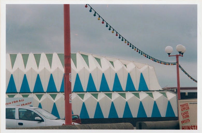
3- This is a photo I took in Norfolk years ago and it’s an example of how I’m drawn to graphic pattern. There’s often a lot of shapes or areas of pattern in my books. I like to simplify elements down to shapes, this is probably why I’m a fan of Paul Klee’s work, Paul Rand and Sophie Taeuber-Arp (whose postcard has recently shuffled to the front).

I think I play with the balance of these three areas on projects. For instance, in my books Look and Hello, there was very little pencil line. The shapes needed to be graphic and simplified to ensure the text within the illustrations was legible. And in Silver Linings, I felt that the pencil line added to the energy of the active characters.
Of course, there’s so much that feeds into my taste and aesthetic and it’s always shifting and evolving. Different ideas and stories need different approaches. I’ve found that working on illustrator-only projects tend to push me further into new visual challenges. (But I’ll save that for another post!)
ALSO…

I was a guest on Lisa Stickley’s Substack series the other week.
I’ve never been good at picking favourites of anything, but I enjoyed giving it my best shot for ‘With What Do I Doodle’. And it makes a nice little companion piece to this post.
I’ll sign off with another great big thank you to the new and old subscribers of the Woodcock Dispatch!
Thank you for reading!
Fiona
So interesting to read Fiona. I love shape too and am a big fan of that spread in Hiding Heidi!
Thank you for sharing these inspirations. I am going through a bit of a frog phase at the moment (just installed a plunge pool for them in the garden) and I too am a fan of graphic shapes and energetic lines. Happy to have found your substack 😊