


When I'm painting windows
An insight into my Frost Goblin window painting process

Hello and a very warm welcome to my first Woodcock Dispatch, the new incarnation of my occasional newsletter.
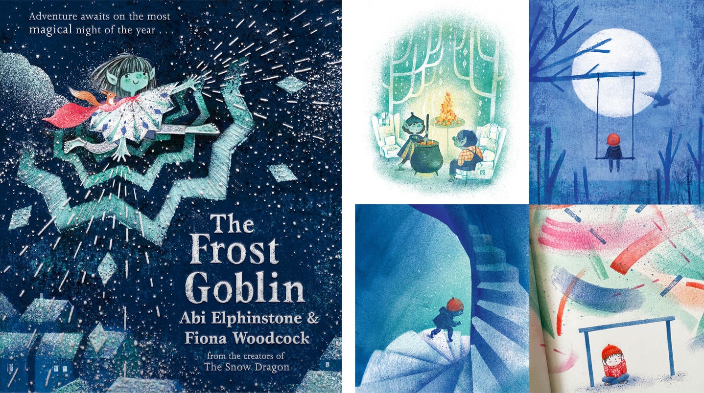
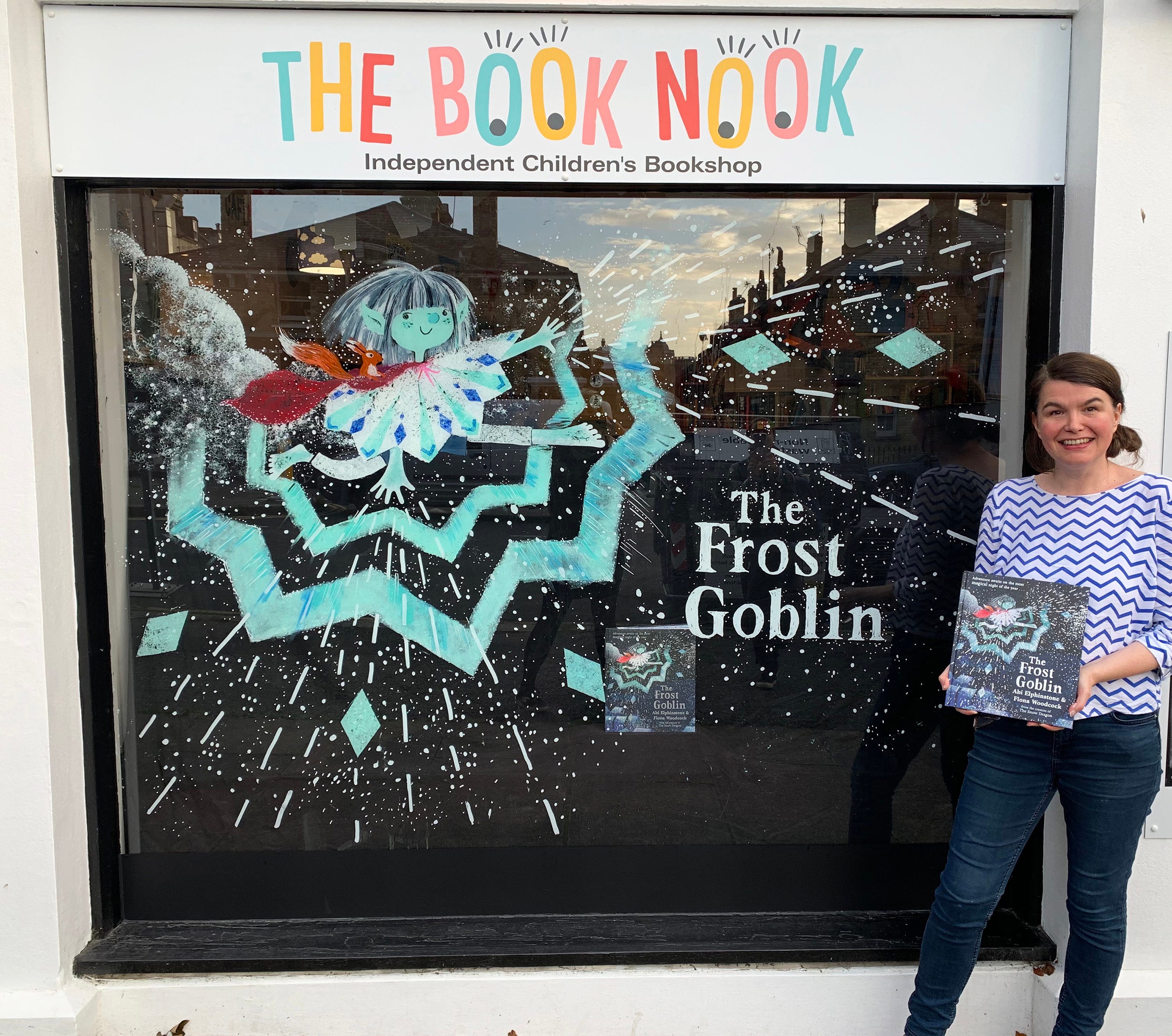
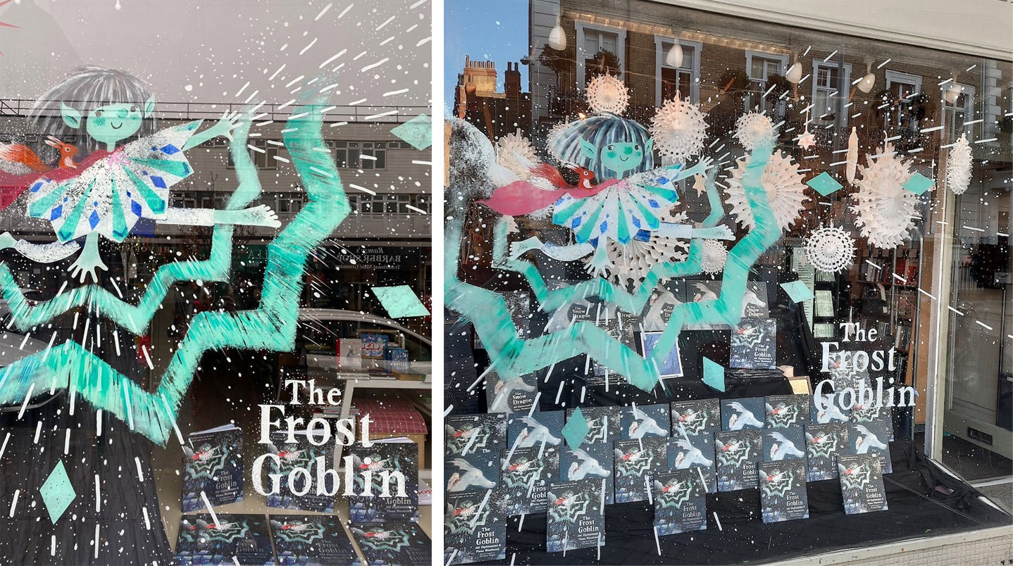
I’ve had a really lovely time of late, painting windows to celebrate the hardback publication of The Frost Goblin, written by Abi Elphinstone and illustrated by me.
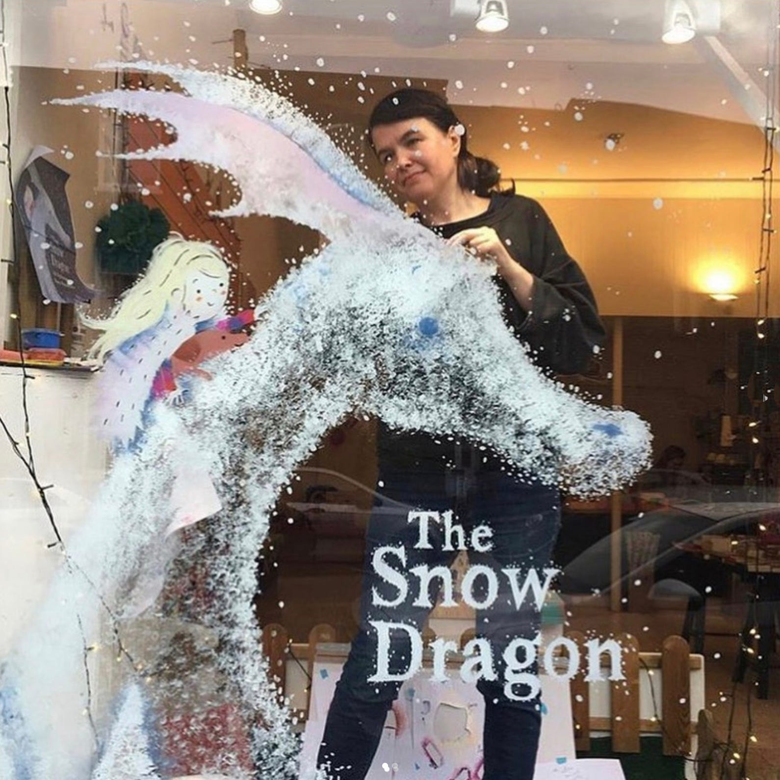
Some of you may have seen our first collaboration, The Snow Dragon back in 2019. I had a fun time doing windows for that book too. The picture below may just capture the exact moment when I realised I love doing them.
Fellow illustrators have been asking about my process and I’m going to talk you through my stages. However, I’m keen to point out that there are many ways of creating a window (I mention other inspiration at the end). My process is really just a large scale version of how I create my illustrations for the books. Like most things, I’m experimenting and making it up as I go along, so it’s by no means a definitive guide. But perhaps my process could be adapted to suit your illustration style, or at least encourage you not to be too intimidated by the prospect of taking on your first window.
It can be quite a terrifying prospect to take on, but I’ve found that it’s all in the prep. Get it all planned out and then you can have a brilliant day in a bookshop doing an enormous painting!

Make a plan - Armed with the dimensions and ideally a photo of the shop window (found online) to get an idea of the set up, I do a Photoshop mock up - thinking about the size and positioning of the design. It’s good to think about the colours (I find light/ white colours tend to work best) and what sort of display will be behind your painting. I do this plan actual size, but it doesn’t need to be high res.
Flip it - Now the really important bit is to flip the image horizontally, so you end up with the mirror image. I find this so counterintuitive, but it will make sense later.
Print it - Print out the image at the size you want to paint it. I did a bit of a hotchpotch printing technique, with a large section printed in black and white at a local copy shop. And I used my home printer to print out little A4 add-ons to extend the design for different window shapes. But next time I’m going to try printing it all in A4 sections using something like this - which comes highly recommended by Penny Neville-Lee. You might not need a print out for your design, but for big character work and title text in reverse, I prefer to make things easier by having reference to trace off.
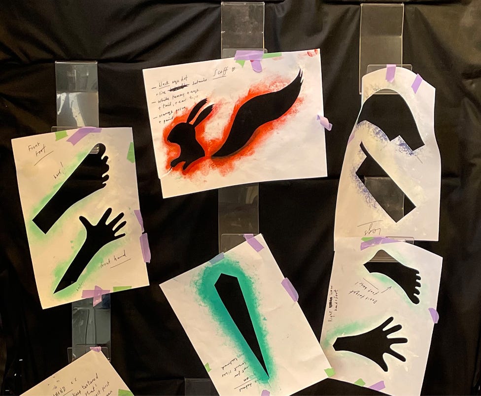
Stencils - I cut simple paper stencils of the main shapes and patterns, using the print out as reference. I use stencils for my book illustrations too (but that’s for another post!)
Paints and Posca pens - If it’s confirmed that the shop is fine with paint on their windows you can get all set up. I mainly used Daler Rowney system 3 Acrylics, and similar. And just so I’m good to go, I mixed up loads of Goblin Green beforehand (never quite enough though!) I also use Posca pens in various sizes and china marker pencils for textured sketchy lines, (which I discovered don’t always work so well on very cold windows). Look out strong masking tape for sticking up the printout, kitchen roll, brushes, sponges etc.
Practice - I’ve not got a perfect practice window at home, so I always do a test of the character on a big bit of acetate. Playing around with a few little texture experiments and checking I’ve got the right colours, just to reassure me that it’s all going to work.

On the day - With the huge printout taped to the exterior of the window, I start working in layers - tracing off and painting key details; eyes, nose, cheeks etc. on the inside of the glass. Whilst those are drying I do other areas before coming back to layer on the green flesh colour on top. You can see the face stencil below, which allows me to quickly sponge on the paint without worrying about carefully defining the edge of the face. From inside the shop, the eyes etc. start to look pale because the flesh colour has gone over them a bit, but it looks fine from outside. And areas that look splodgy or streaky tend to appear a lot smoother from the street. It makes life easier if I work with the imperfections and don’t get too hung up on exactly replicating the book illustration.
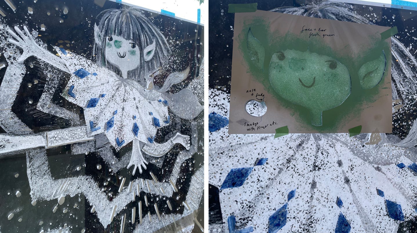
I used Posca pens to trace off the frost lines and dots and got all the other essential information loosely plotted out, with little dotty lines to indicate the zig-zag graphic shape. The frosty texture on the cape (seen below on the right) was created by painting with some scrunched up plastic packaging. I discovered this technique a bit late for the book interiors unfortunately!
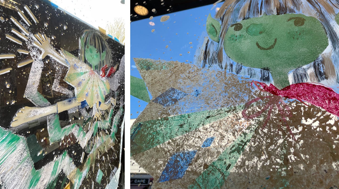
I’m always in a hurry to take the reference paper off, so I can do all the final bits, whilst regularly running outside to check how it’s shaping up. You can see how I sponged on the zig-zag graphic in the video below, filmed at Book Nook Hove.

Then I traced off the Frost Goblin title text from a separate smaller printout. (again - make sure it’s flipped!)
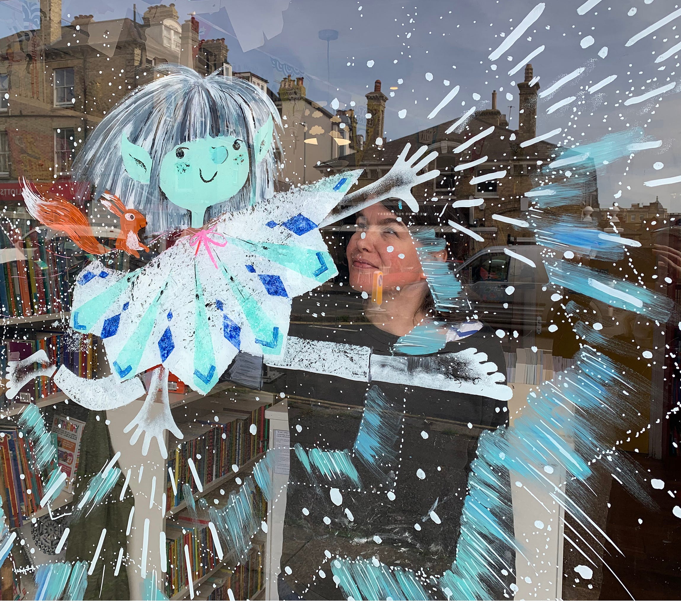
And ta-da, here’s the final window!
Phew, all done! But not quite, you now need to try and get ‘The’ photo for social media. This can be a tricky challenge, dealing with reflections and impending nightfall! But the wonderful booksellers will always do all they can to help with this, even if they have to take a quick snap the next morning before the lights go on.
I’m trying to get the balance right between encouraging you to do this, whilst also being realistic about the amount of work involved. Posca pens can dribble, stuff doesn’t always go to plan, but it’s on glass so you can take a bit off and quickly try again. For me, it’s worth the effort - I love the liberation of working on a big scale and enjoy chatting to passers-by, personalising books and getting an encouraging thumbs up. It’s a pleasure to be in that world for a day, each bookshop is unique and I’m always in awe overhearing booksellers knowing the exact book for someone’s nephew!

Other window inspiration - (click through to links)
Another option is to have the character printed on a foamboard standee and go free-range without a printout like I did on my Poppy and The Blooms window.
This brilliant Be More Bernard window created by Kate Hindley’s (written by Simon Philip) really raised the bar a few years back.
Sophy Henn does fantastic graphic windows with very effective tinsel curtains behind. Sophy talks about her window process on Steve Lenton’s Studiomate Steve podcast. (which I highly recommend!) And Steve also does lots of striking windows using printed boards and props.
Simona Ciraolo made exquisite hand crafted paper flowers for her When Mino Took The Bus window.
Fiona Lumbers creates stunning windows with hand painted boards and adds painted text and details to the window.
Sarah Massini translates her book illustrations into window painting so beautifully in The Little Prince window (retold by Louise Greig).
For even more inspiration you must read Jane Porter’s brilliant blog with her window painting tips.
And finally this video of an all time favourite window for Mac Barnett and Jon Klassen’s book - Sam and Dave Dig a Hole. Not so much painting for this one, but a window full of dirt.
I hope this unexpectedly epic and admittedly niche newsletter has been useful, do let me know and share any tips in the comments.
There’s a lot more I could tell you about The Frost Goblin, but for now, this wonderful review and frosty pics by The Little Literary Society gives a lovely overview. I hope you enjoy it if you manage to get a copy.
Thank you for your time today, hopefully you’re all easing gently into your festive break. Wishing you the best for a happy and creative 2023!
Fiona.

The Frost Goblin written by Abi Elphinstone is out now in hardback. Published by Simon and Schuster.
Thank you to Book Nook Hove, Ottie and the Bea and South Kensington Books for all your support.
This is so brilliant to read. I haven’t painted a window yet, but when I do I’ll be looking back at this! Congrats on a beautiful window too ❄️
Beautifical :)